Wells Fargo Credit Card Prototype
Wells Fargo asked us to create a prototype experience that explored new a digital style while staying consistent to the brand’s core design aesthetics. As the Lead Designer on this project, my challenge was to provide a host of modern design looks. I looked to many places for inspiration—namely the fashion industry—and I decided on a lot of white space, use of italic font and unique product photography. I used Marvel to create rough, sharable designs to present our work.
Ultimately, these were some of the clients favorite looks.
+ CLIENT - WellsFargo
+ AGENCY - Organic
+ ROLE - Design Lead
Design1:
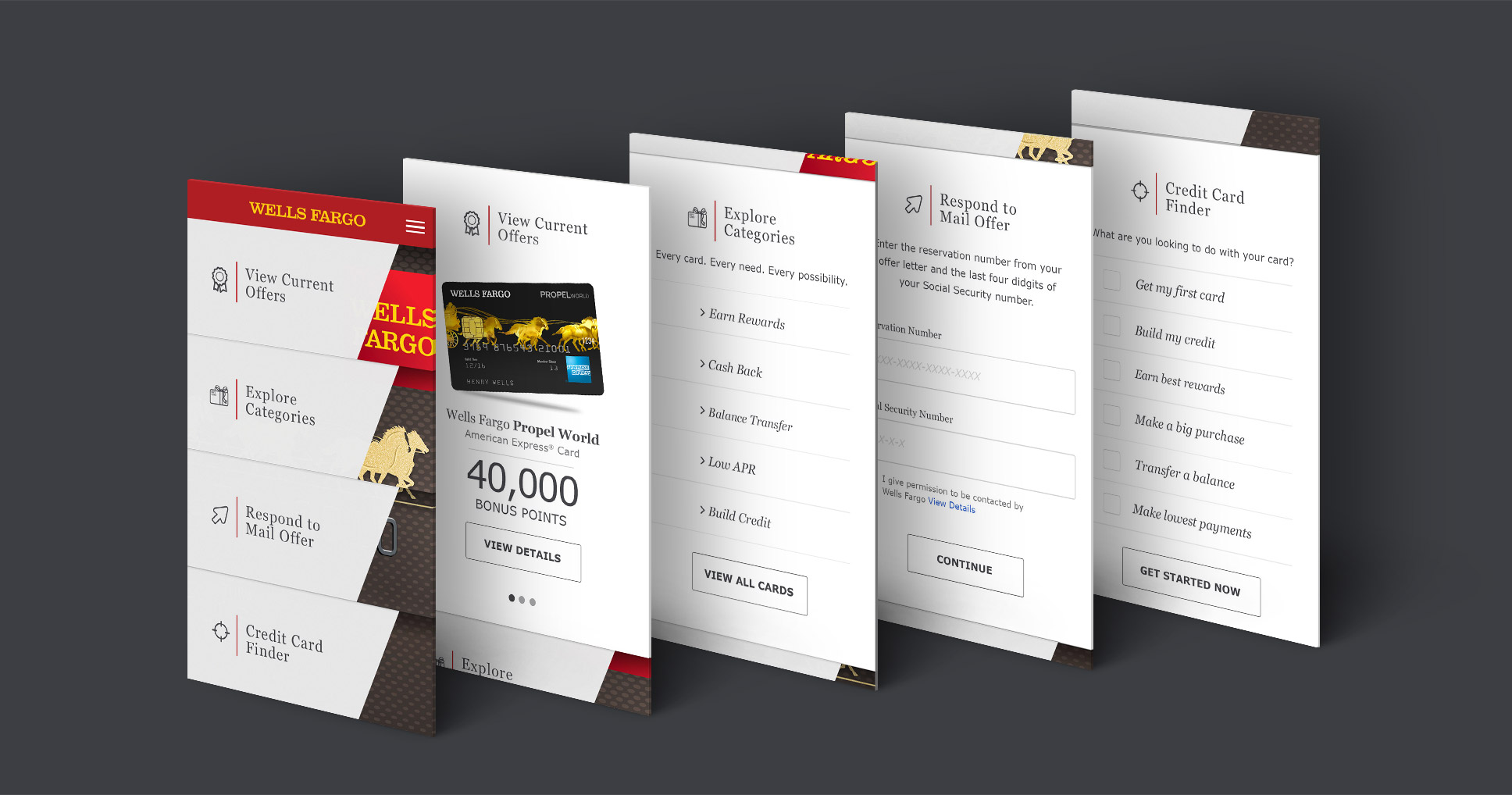
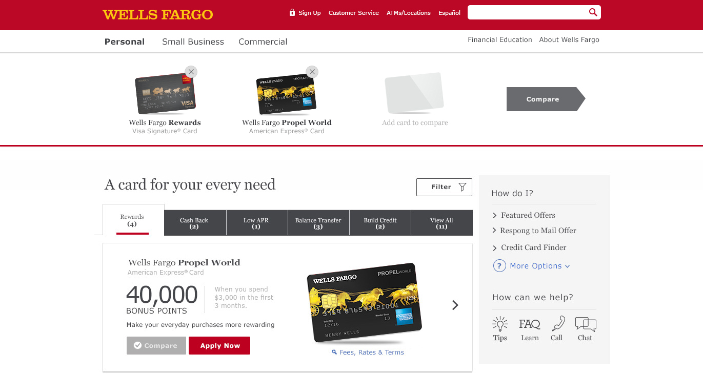
The credit card experience has four main entry point and I wanted to focus on those actions upfront in the landing page. Creating a very simple and clear user flow. I always start my design mobile first because i know if i can solve all of my design problem is such a small space desktop design would easily evolve from mobile column layout.
Mobile Landing Page:
Desktop Landing Page:
View All Cards Page Detail:
View All Cards: Compare Cards Stickie Bar
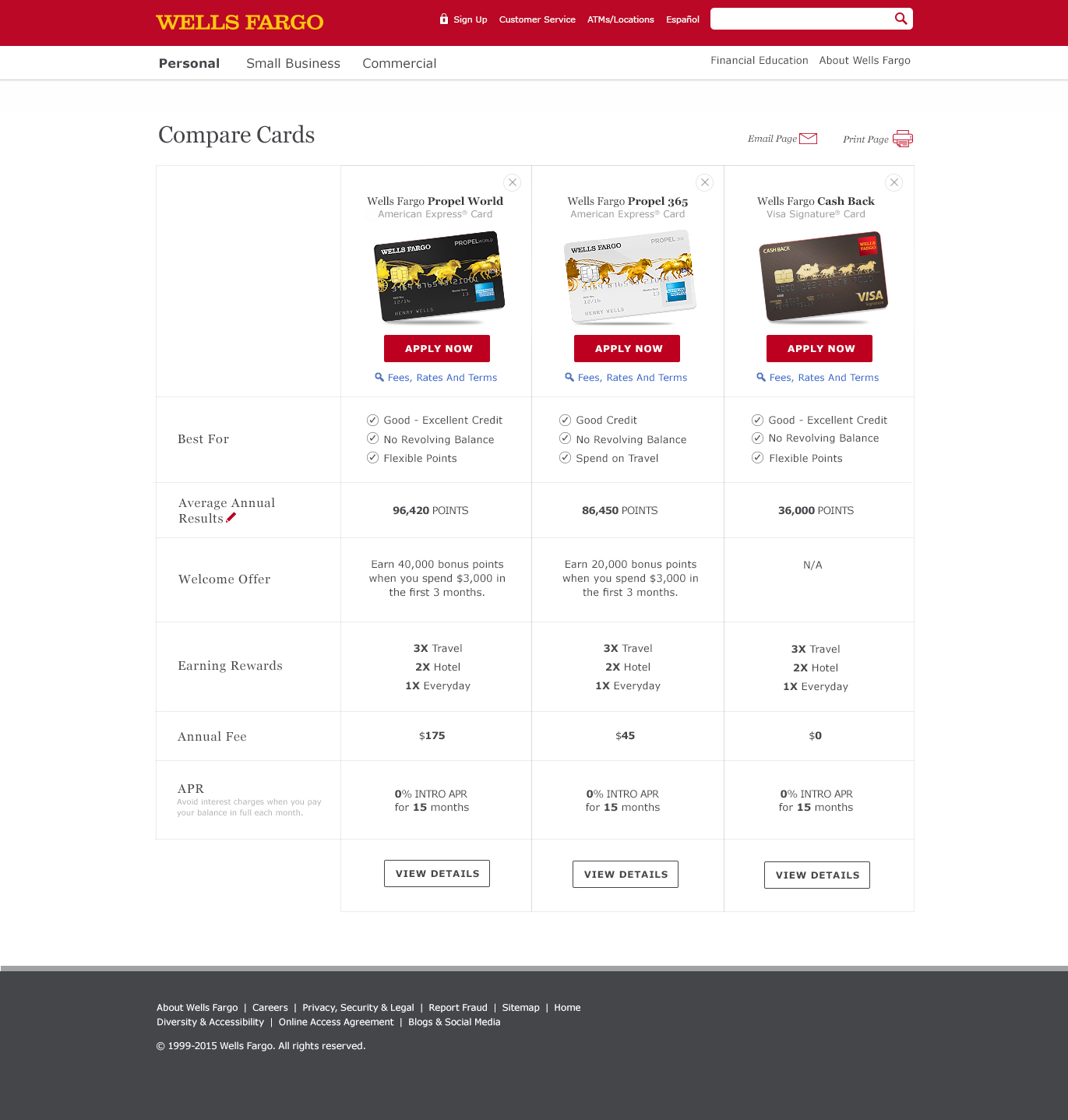
Compare Cards Page:
Design 2:
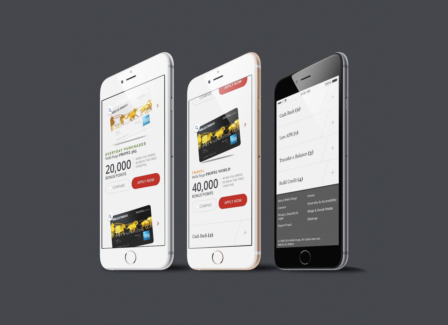
For this design I wanted to create more visual interest while again being consistent with the Wells Fargo guidelines. I was inspired by the clean and simple look of fashion websites. But I also wanted to add a gray background because I felt it added elegance and elevated the brand. Using the credit card as the "product" that bring visual interest and becomes the focal point of the experience. Plus the modern button and UI treatment would appeal to the much sough out millennial target.
View All Cards Page Details:
Compare Cards Page & Compare Stickie Bar:
View All Cards Page Detail: Mobile
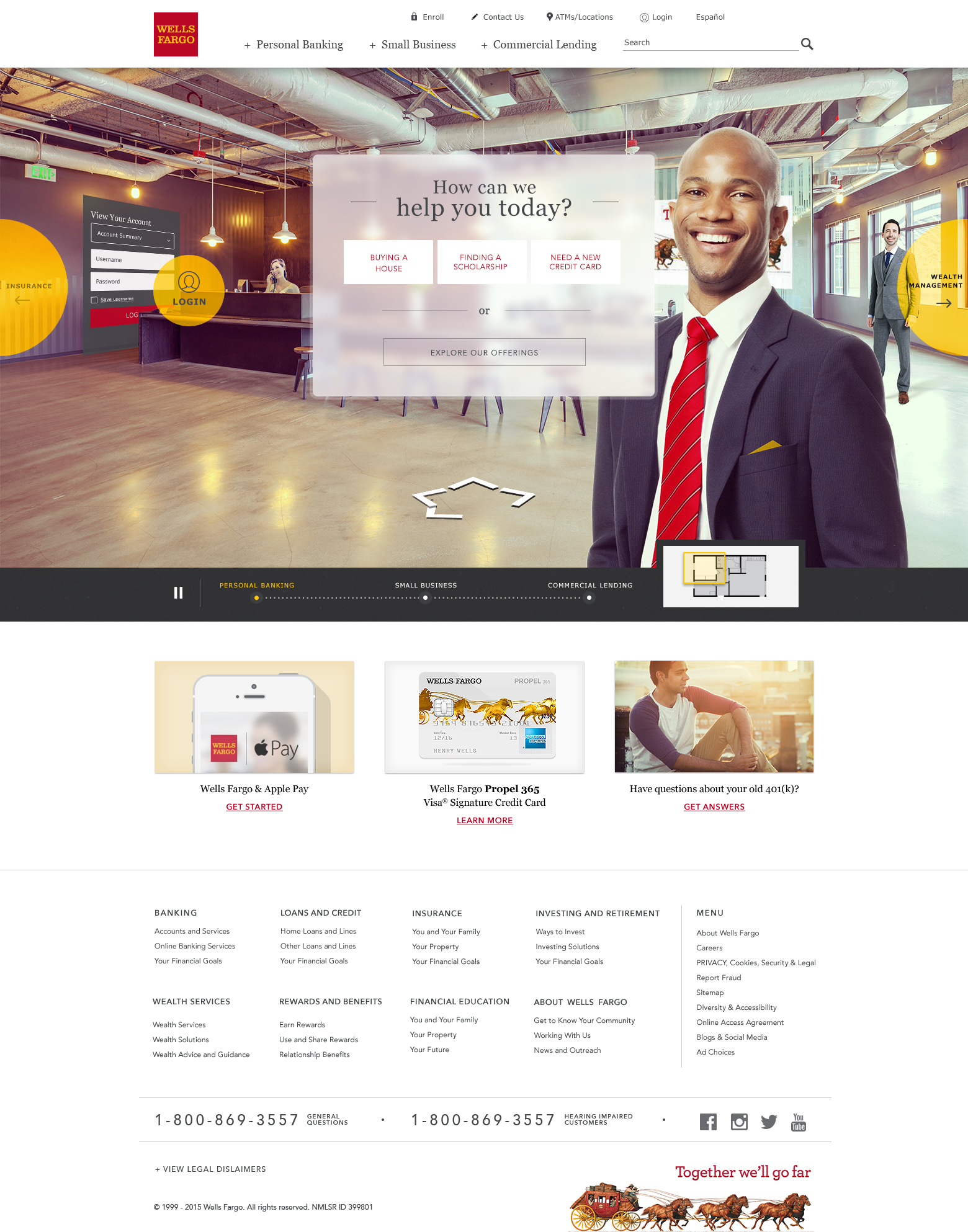
Wells Fargo Homepage Concepts
After our team success on the Credit Card and Home Mortgage Loan prototypes I lead design explorations for Wells Fargo Homepage. The goal was to present 2-3 different approaches to the homepage experience.
BRAND:
OMNI:
AUGMENT:

